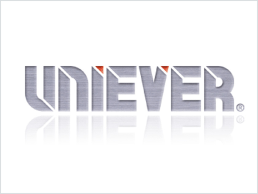
The Origin of the Brand Name "UNIEVER"
The Unisis brand name UNIEVER is a fusion representing the desire for
continued existence as one “unit” of a “unique” organization “forever.”
All employees share this goal of the founders, with the additional aim of
“earning customer trust”

Symbol Mark
Our logo is a “U” in the shape of a heart. It stands for “UNISIS,” which
simultaneously represents friendliness, warmth, and life, symbolized by
the shape of the heart. The ends of the “U” extend beyond the border of
the oval frame to signify our infinite possibilities beyond the present status.
The oval shape of the frame is a metaphor of our status, which is not perfect,
but at the same time expresses our wish to get nearer to the circle, perfection.

Coporate Color
We have selected the color “blue” for our logo, which refers to our planet
Earth to emphasize that we market the entire world. Accordingly, the shade
of blue we chose is sea blue, because the sea is the wellspring of life. We feel
that the color matches our perspective as a provider of medical supplies.
The red represents the earth, in contrast to the blue sea, while the gray color
stands for steel, the material of our products. We are also constantly evolving to create new products in new fields.